Work
Reflecting the School’s Culture
Nobles Redesign
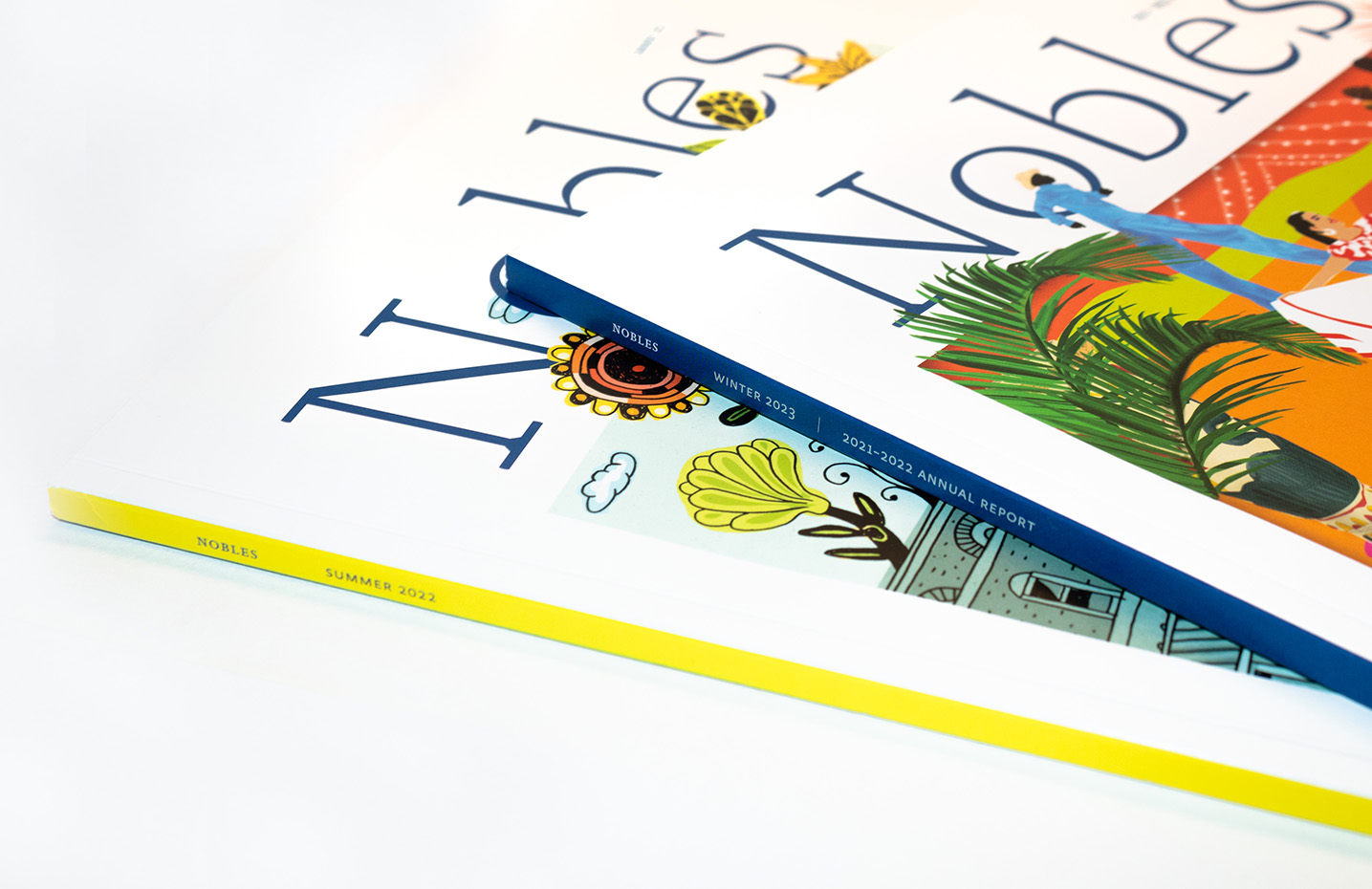
“How often should you redesign an alumni magazine?” This is a question that comes up a lot in discussions with clients and peers. Unsurprisingly, there is not a universal answer. The question that should be asked is, “Does the magazine still reflect the institution?” An alumni magazine is meant to connect a community with their alma mater. Capturing the culture of that place should guide the mission, content, and design direction.
Nobles, the magazine for the Noble and Greenough School community, no longer reflected the spirit of the school. While the original design was elegant and timeless (full disclosure: we redesigned it in 2012), it no longer felt like the present-day school. Since the original redesign, school leadership has changed, new facilities have been built, and the face of the student body has evolved. The current magazine needed to reflect this new, vibrant, and diverse place.
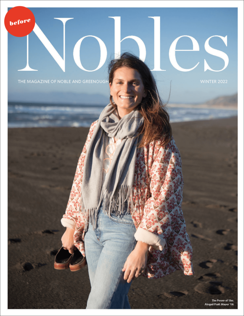
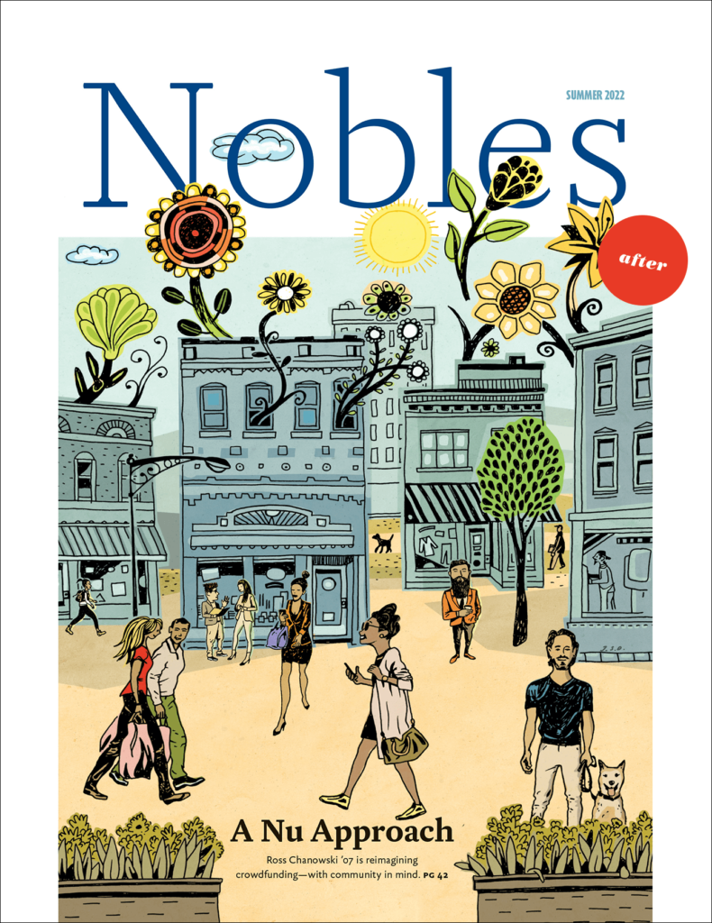
A critique of the previous magazine by our strategic partner Vicki Glembocki revealed opportunities to expand the diversity of content and types of stories. Introducing more of the campus experience is particularly important in an independent school magazine; using less copy and more imagery makes the overall publication more joyful.
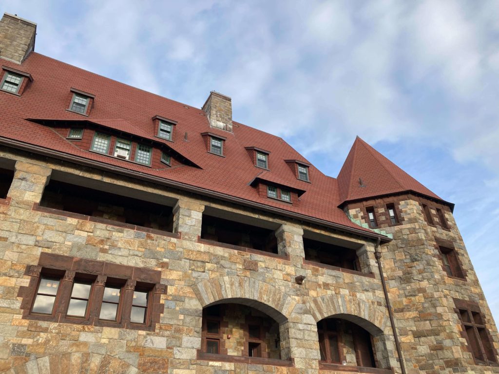
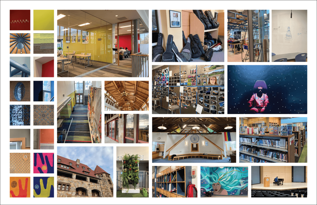
With that lens, we visited the school for inspiration—and it was everywhere. The details in the architecture and space (from walls to carpeting, posters on bulletin boards, student and alumni artwork on the walls throughout the buildings), the vast and beautiful landscape, and the spirit of the people—this intake influenced and informed the colors, fonts, and visual direction we developed when we were back in the studio.
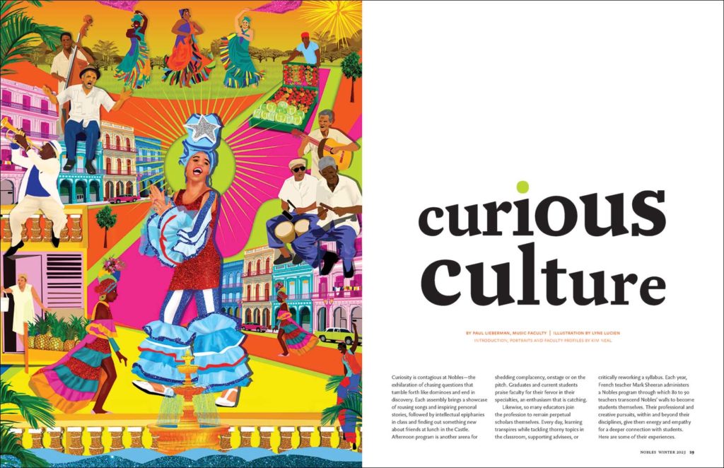
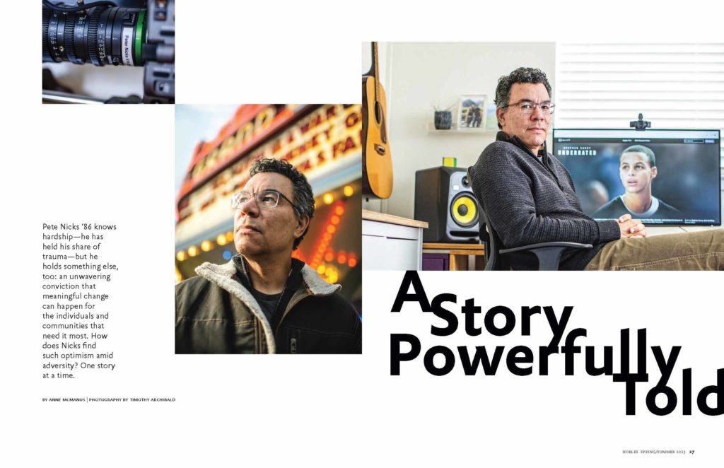
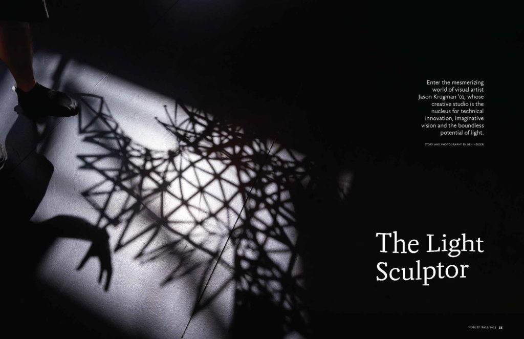
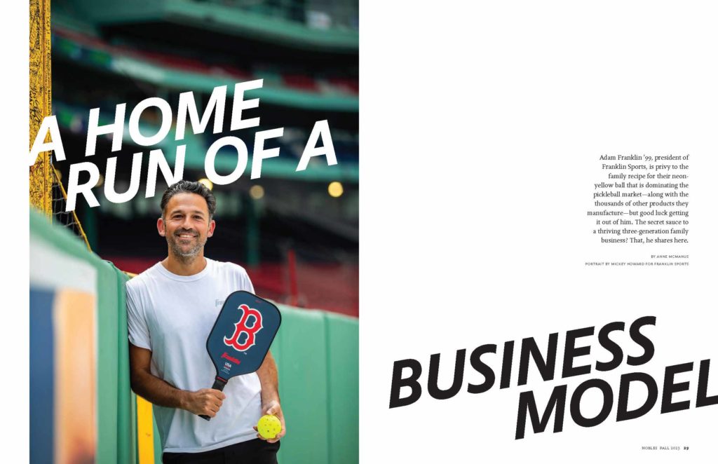
Images were selected and placed into visual mood boards to guide the development of the design direction. We looked at what colors came forward and how best to interpret the architectural details into font selection. We also knew that Nobles’ internal team had serious photo and video chops and we wanted to make sure that their work was highlighted. Although we used very little illustration in the previous version, we introduced multiple places for illustration in the redesign, including morning highlight experiences, portraiture, and the cover.
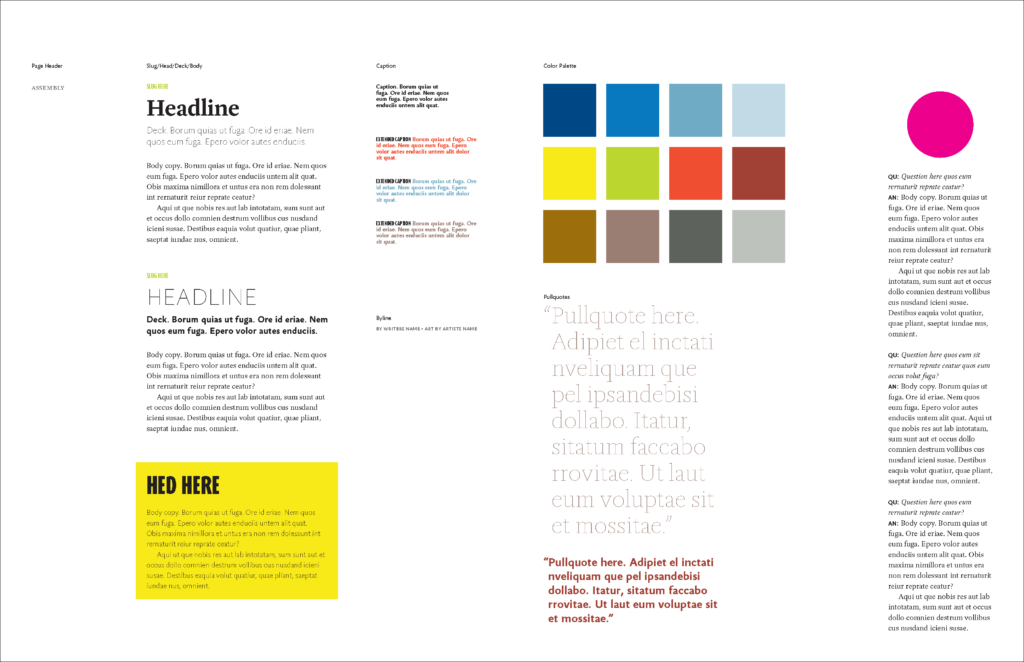
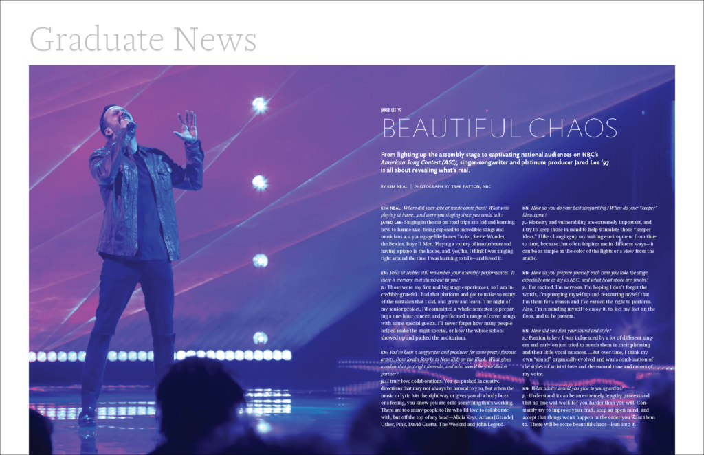
While we decided to keep the format the same, we updated the magazine logo and added a white border around the cover. The border is interrupted by the image to embody a sense of curiosity and spirit, one that cannot be contained. The magazine opens with three spreads of campus photography to highlight the school spirit. (And take advantage of the team’s skill sets!) Bright color blocks are placed throughout to complement the school’s traditional blue. Shorter stories and varied formats engage the reader from cover-to-cover, and features are beautifully crafted with originally commissioned photography and illustration. The Graduate News section opens with a full spread profile highlighting an accomplished graduate before heading into the class news to read more.
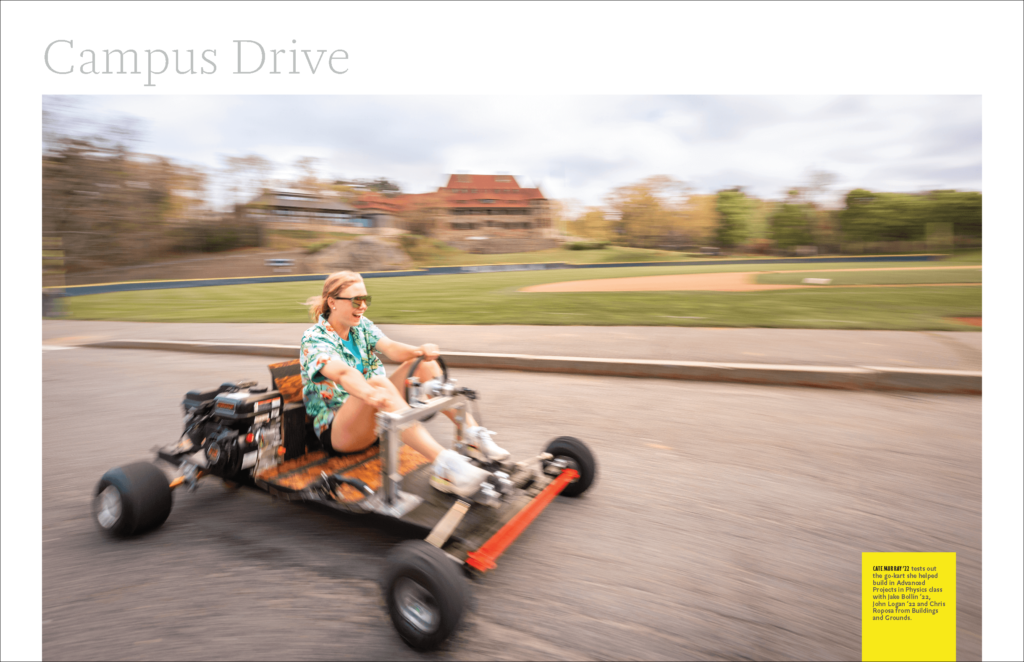
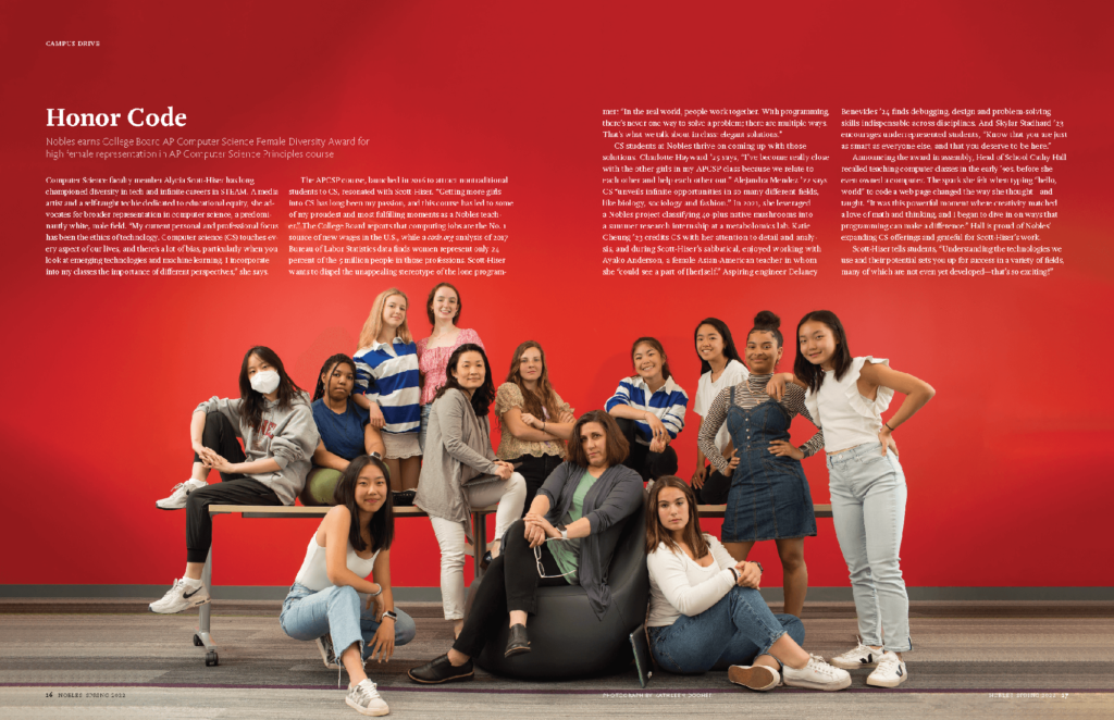
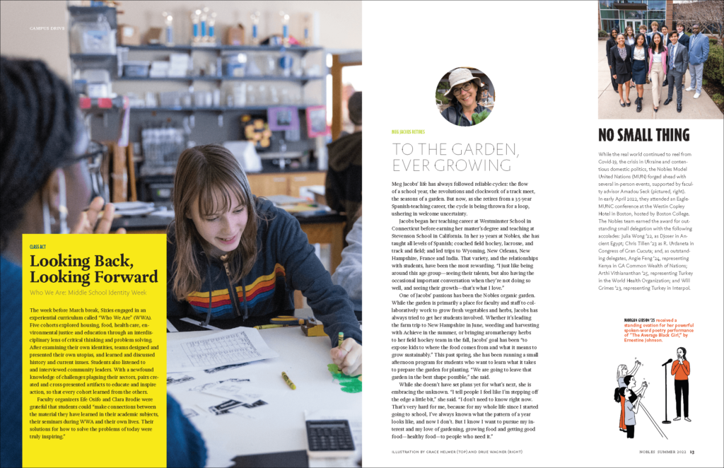
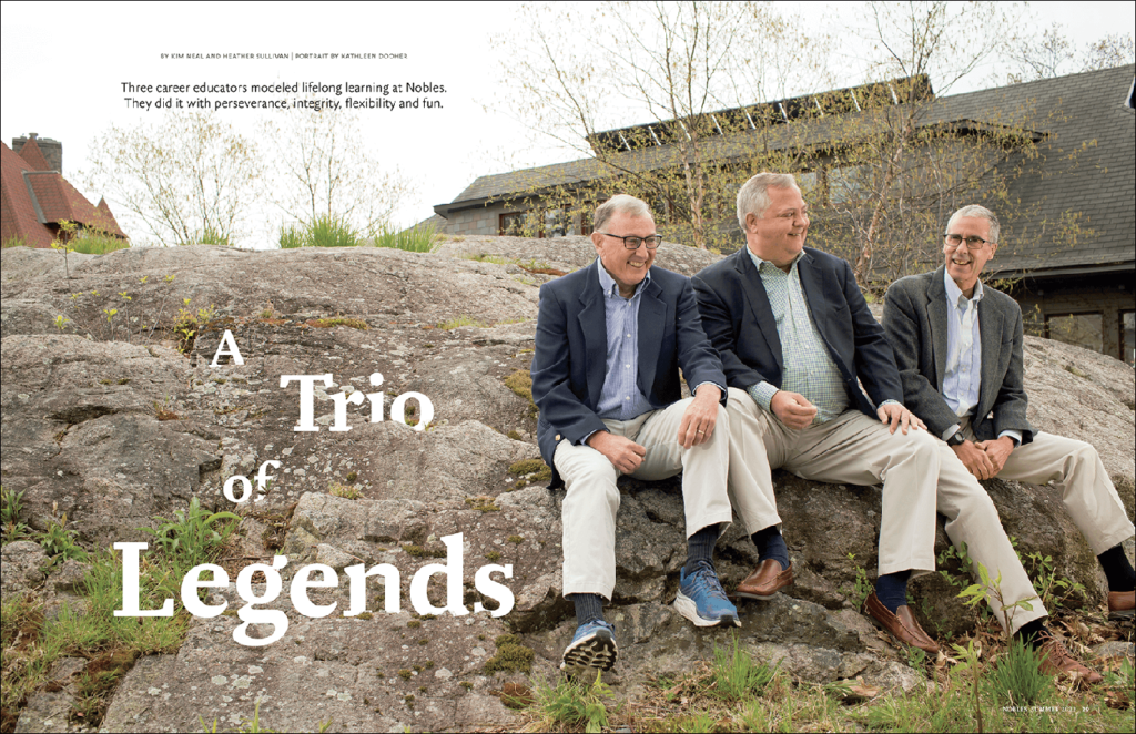
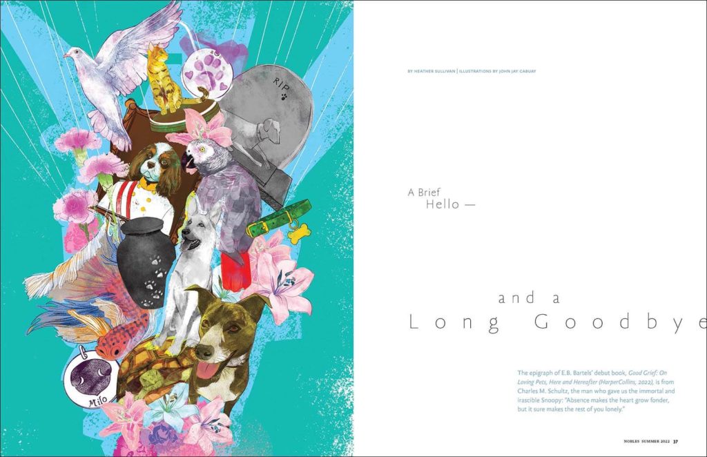
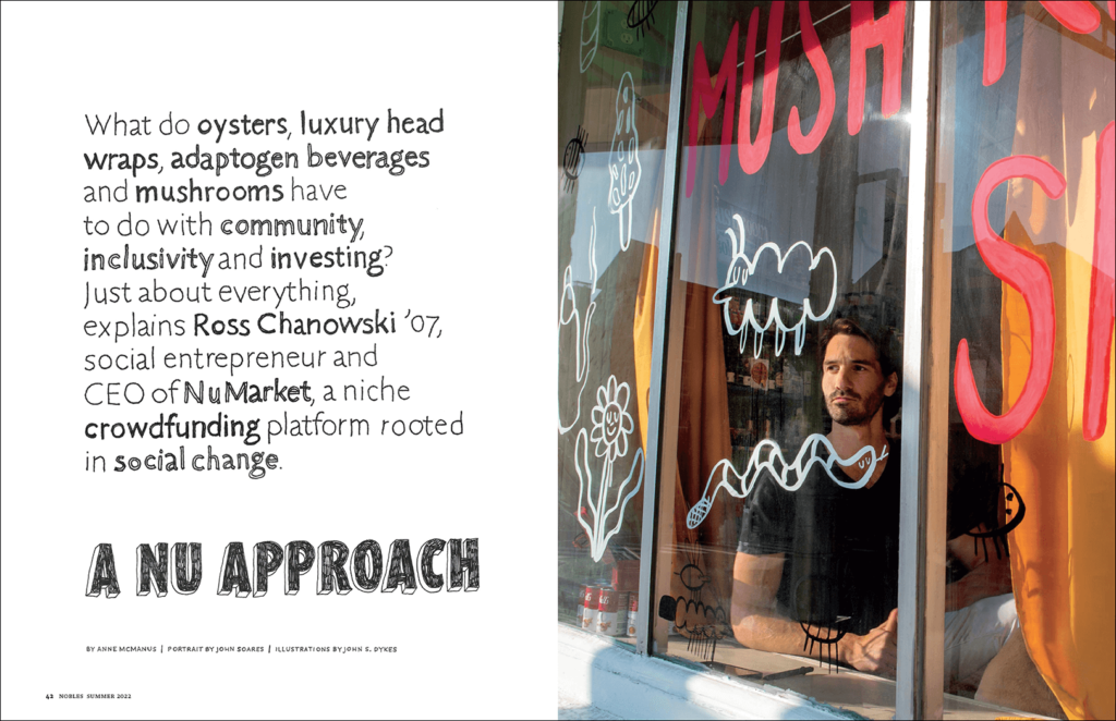


The team at Nobles agreed that the redesign is a joyful and accomplished publication that is the spirit of Nobles.