Work
Creating Reader-Focused Journals
Oncology Nursing Society
Journals and research publications tend to be dense with content, dull and inconsistent color schemes, and overexposed cliché stock imagery—none of which offers any value to the reader. This was no different for the two Oncology Nursing Society publications: Clinical Journal of Oncology Nursing and the Oncology Nursing Forum.
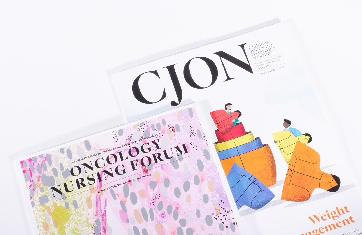
Our engagement began with the Clinical Journal of Oncology Nursing. During our intake, we learned that the journal was often referred to as “CJON,” a quick alternative handle. We recommended exploring a name change as part of the redesign. By changing the name to CJON, there would be a direct connection to the online version, cjon.ons.org, and this would allow the society to be more strategic in its print/digital plan. In contrast, Oncology Nursing Forum was a research publication that needed to retain its formal name.
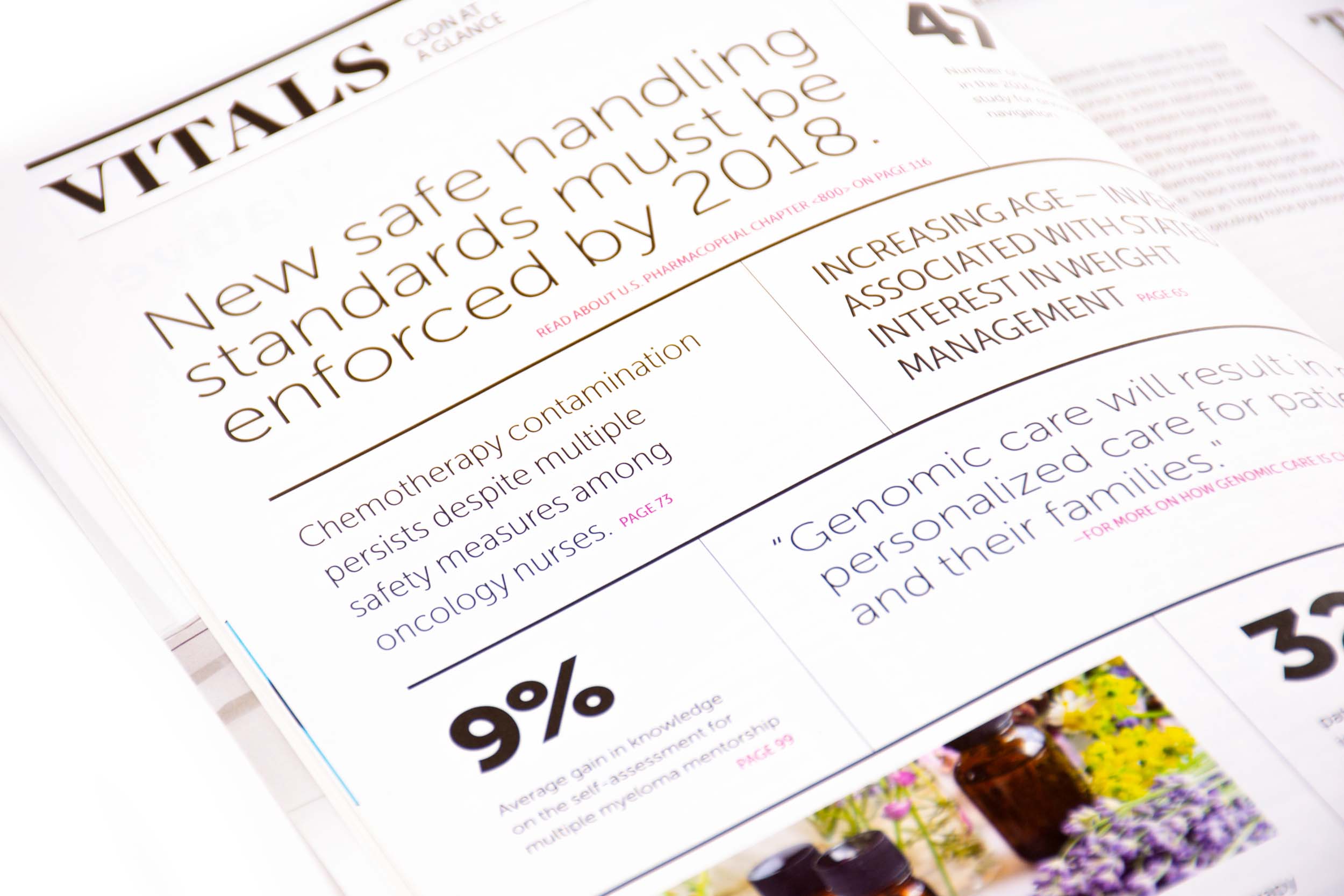
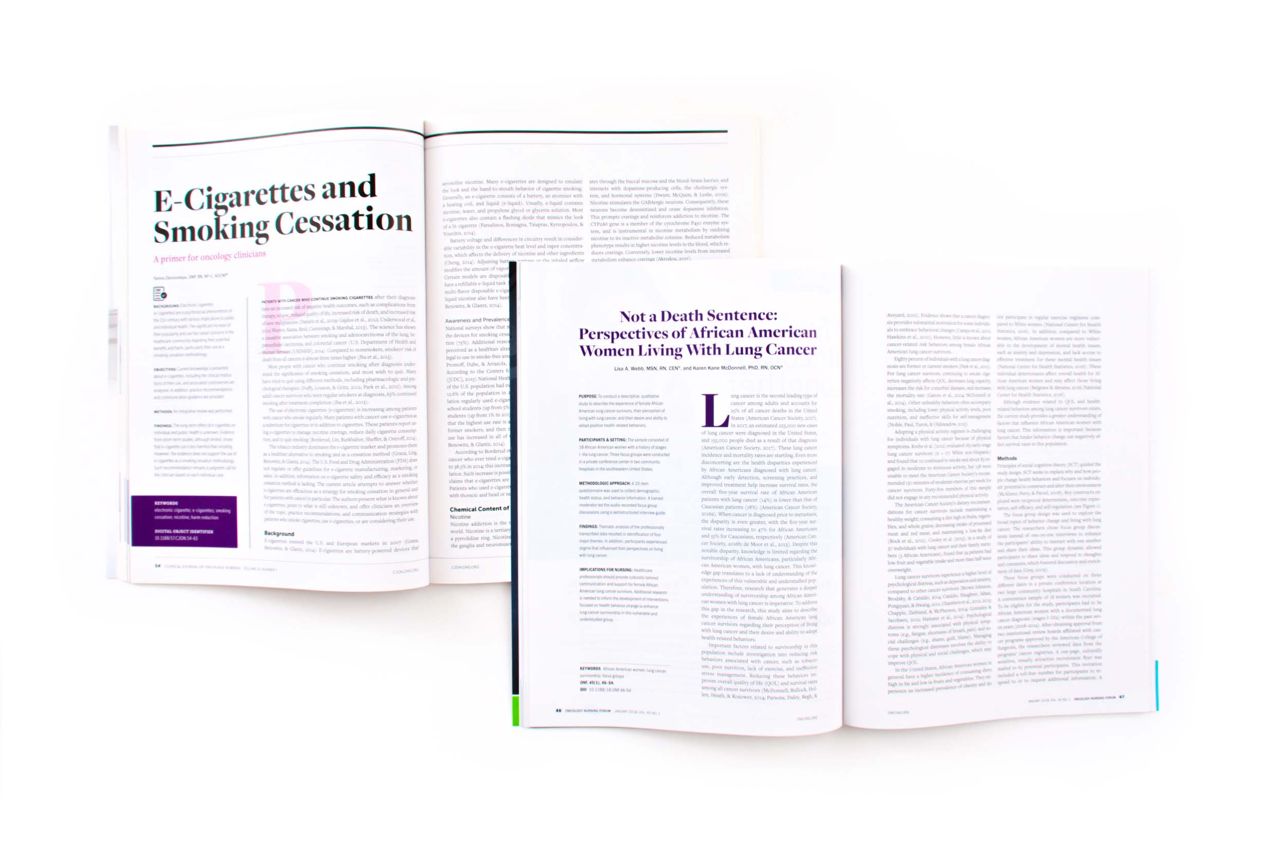
We eliminated the use of stock imagery in both publications and let elegant typography take center stage. The font palette we selected included bold-yet-friendly typefaces for display and a highly legible font for the body copy to increase text readability. All of the fonts were selected from Adobe, which allowed ONS to utilize them with no additional line item on their budget.
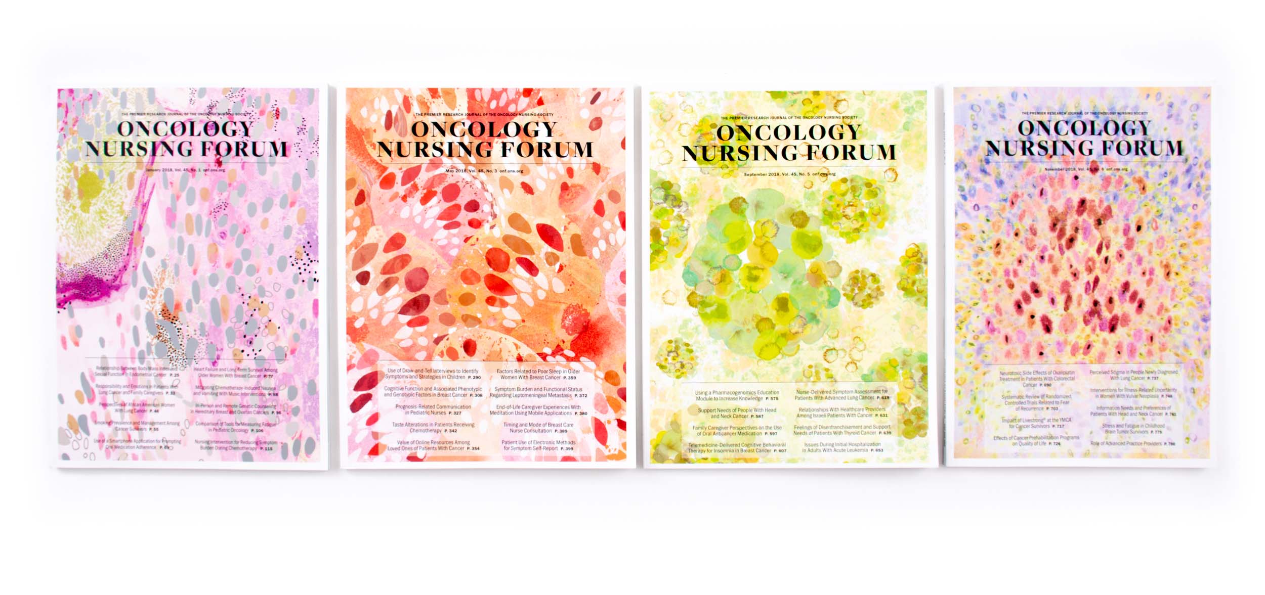
With the removal of imagery from the publication, we recommended that ONS use their entire art budget to commission an illustrator for the covers. Each cover of CJON has a unique illustration to highlight a featured article, making the journal feel fresh and different from issue to issue. For Oncology Nursing Forum, an illustrator is commissioned to create abstract artwork based on research images for all six covers of the year. The ultimate result is two fresh publications, each with a long shelf life, that readers want to dive into and share with their colleagues.