Work
A Unique Digital Experience
St. Mark’s School Enrollment Campaign
What do a 14-year-old student and a 40-year-old parent have in common? Not much. Then why are enrollment communications created to speak to both segments simultaneously? We decided on a different approach.
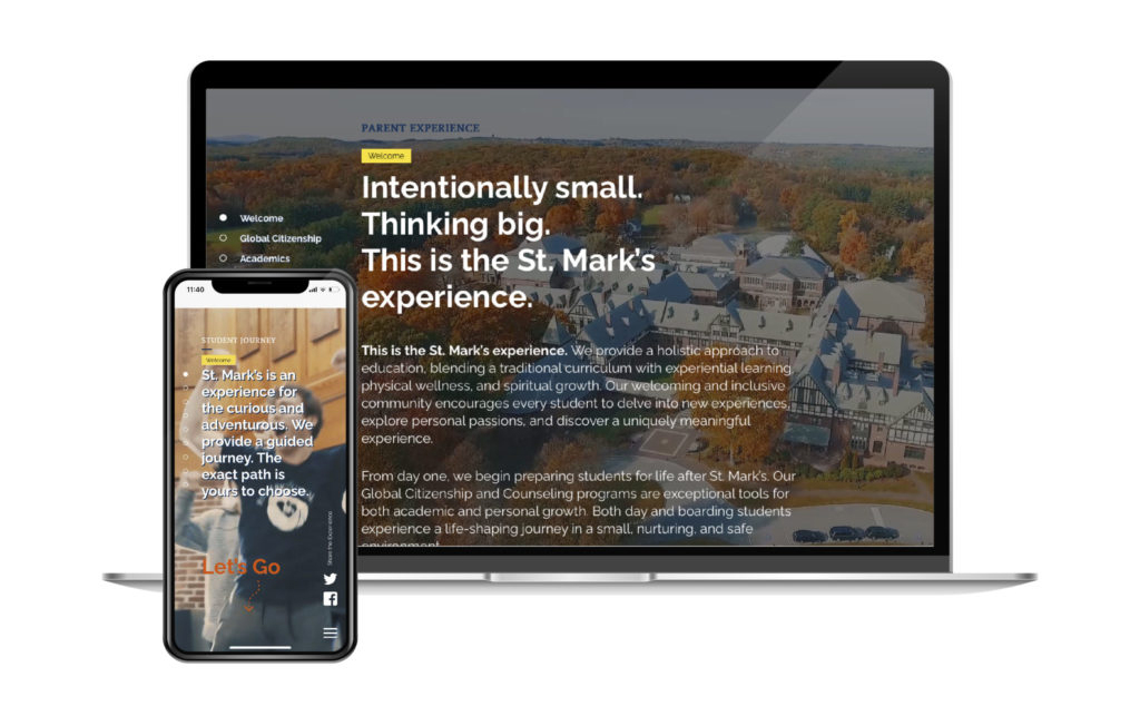
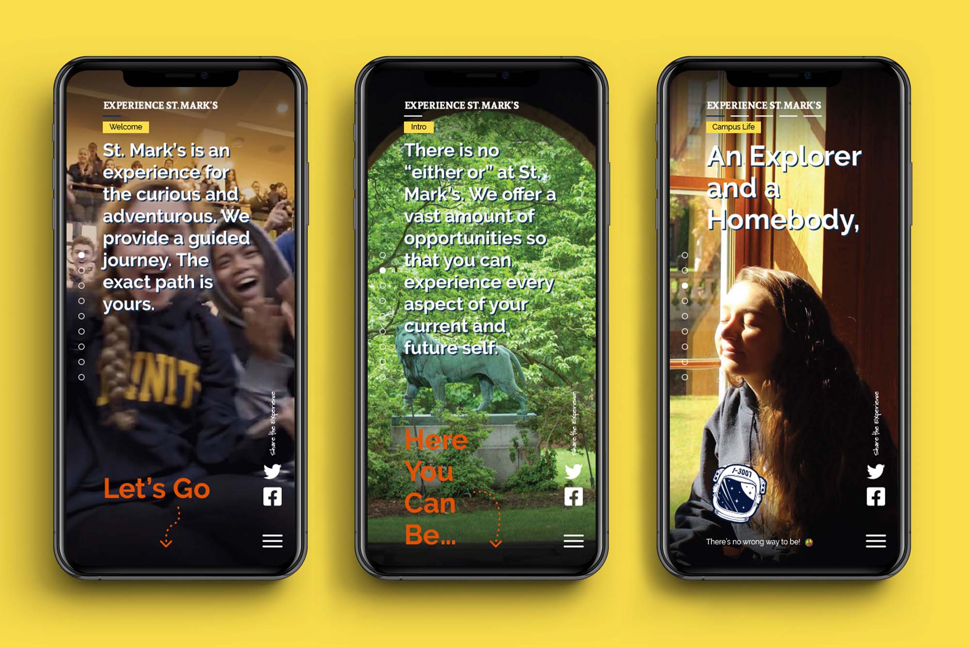
“Rethinking the traditional” was the foundation for a microsite 2communiqué developed for St. Mark’s School. Our research revealed three important factors: First, teenagers are drawn to visual sites with minimal copy, and these sites are primarily viewed on phones. Second, the student often makes the final decision on where they’re going to school, reinforcing the student as a critical audience. And third, the ideal St. Mark’s candidate is a curious student who is looking to define their future.
With this in mind, we developed a two-pronged microsite that allows the visitor to either explore the student’s journey or the parent experience. Influenced by social media, the student’s journey component includes unconventional navigation, a vertical and horizontal scrolling experience, an animated map, and hidden content that is revealed by engaging with the design.

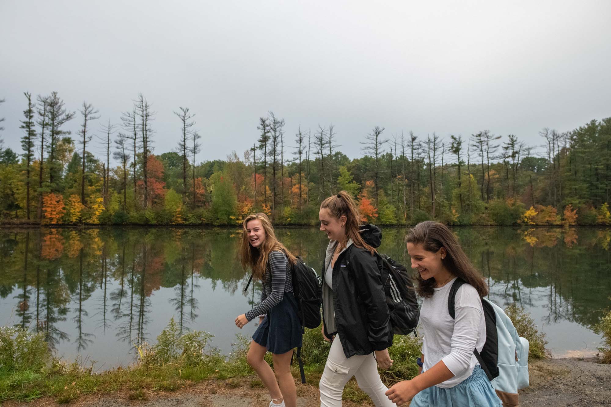
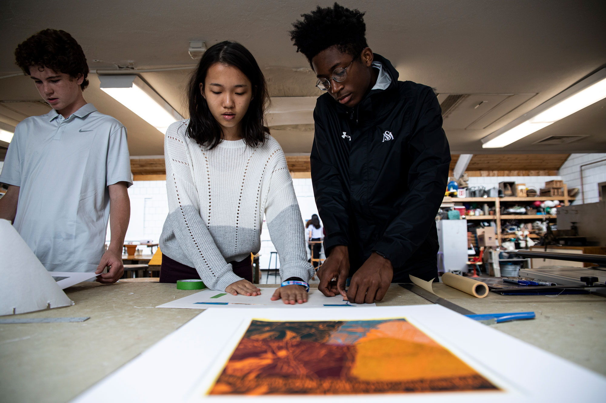
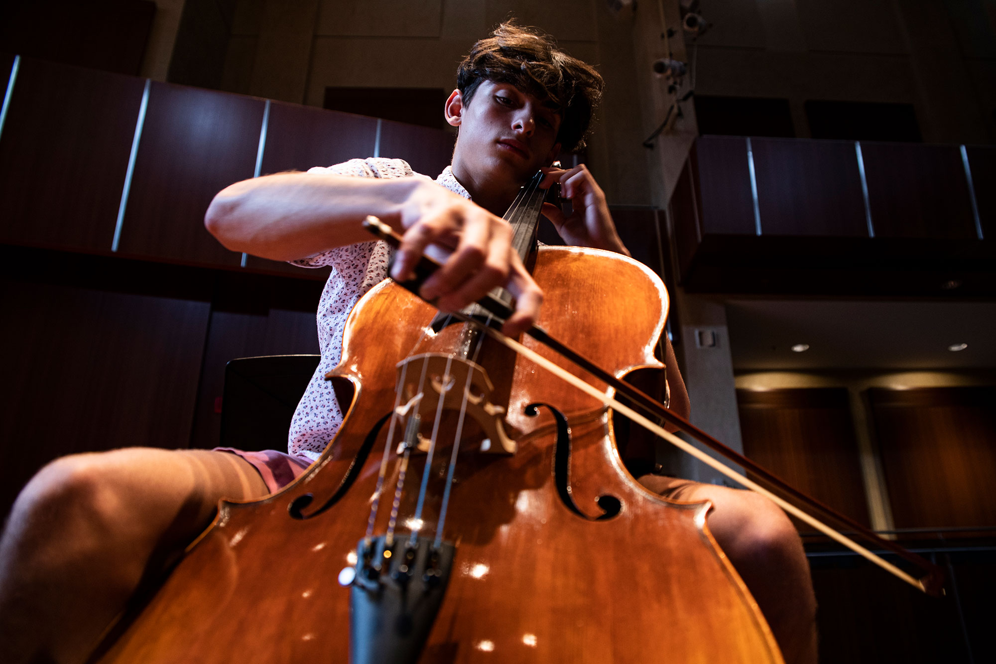
Due to the coronavirus pandemic, we were unable to produce original photography or video for the site. Fortunately, the school’s extensive, well-cataloged galleries made it possible to curate a set of images that blends beautifully with the design direction and content. From their existing video footage, we were able to produce new videos that connect with a younger audience.

The parent experience was created to parallel the student journey. This curated story takes the parent through key academic, experiential, and student life information with the goal of introducing the lifelong educational and career impacts that St. Mark’s will have upon their child.
