Work
The Most Beautiful Place on Earth
Cate School Enrollment Campaign
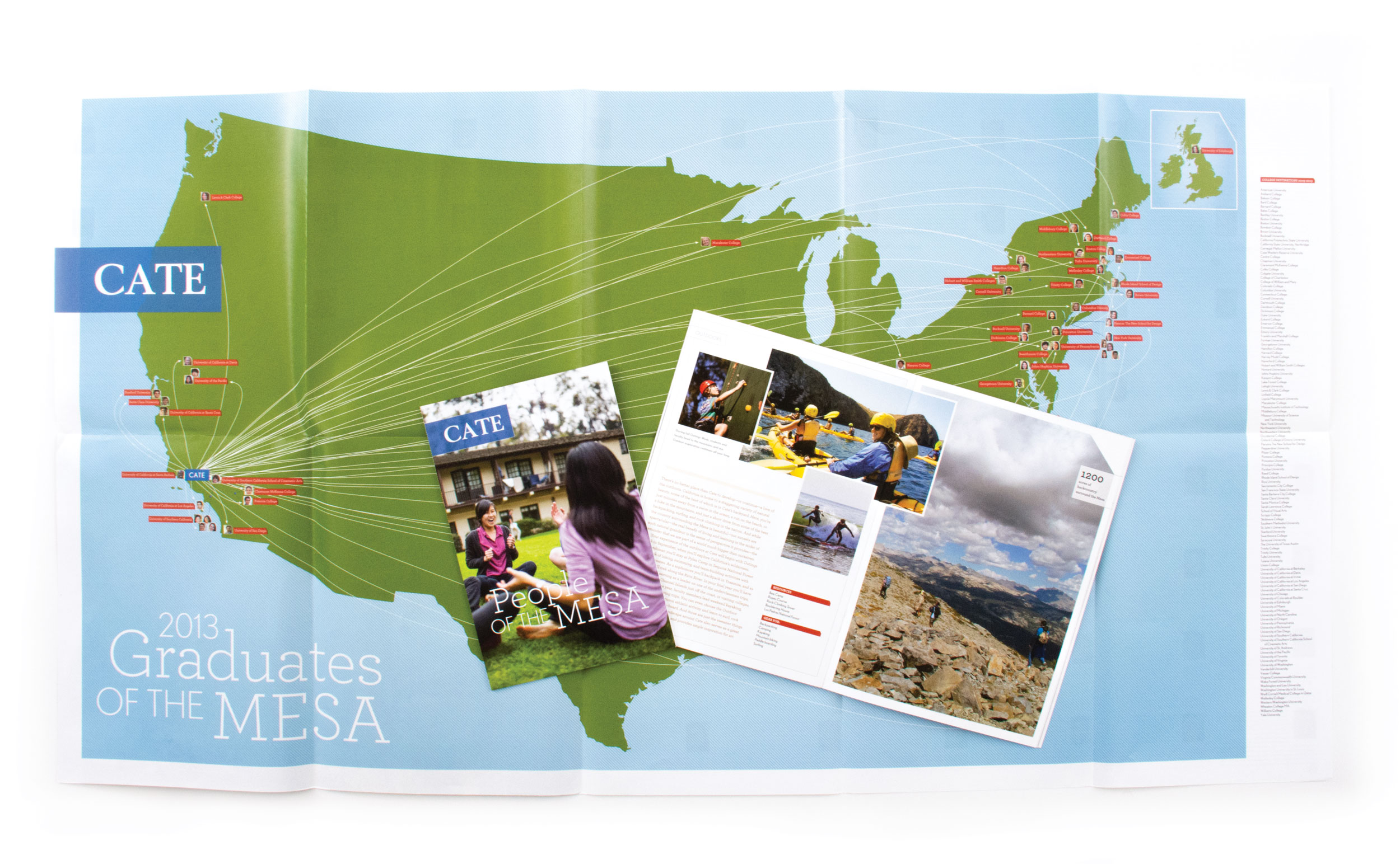
The primary goal of enrollment communications is to engage prospective students with an independent school, encouraging a visit to the campus. Prior to COVID, when students and families were free to travel to independent campuses, school visits were a key tool in enrollment-management strategies. The more opportunities for prospects to meet faculty, engage with current students, and experience campus life, the better.
The Office of Admissions at Cate School knew that 97 percent of prospective families who visited the Carpinteria, California, school applied. This is hardly surprising considering the words of Sarah Kidwell, director of marketing and communications: “It’s the most beautiful place on earth.”
When 2communiqué was engaged to reimagine Cate School’s enrollment communications, we knew a visit to the West Coast campus had to be our first step. After experiencing the breathtaking surroundings and conducting numerous interviews, we began crafting a set of materials inspired by the location and people. A vibrant and warm color palette, approachable typography, and illustrative portraits became the foundation for the design directions.
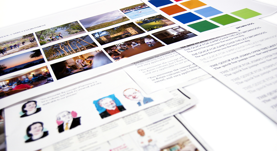

We knew that Cate’s competition included Northeast schools, where students endure long, cold winter seasons (hey, we’re Northeasterners—we know), so we wanted to emphasize Cate’s scenic location on the warm Pacific Coast. Wanting to highlight the intimate campus buildings nestled into a hillside and surrounded by a majestic landscape, we directed Ben Morris, multimedia coordinator, to capture the place through approachable day-in-the-life photography.
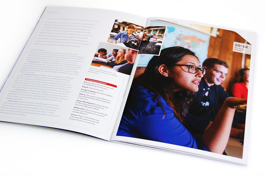
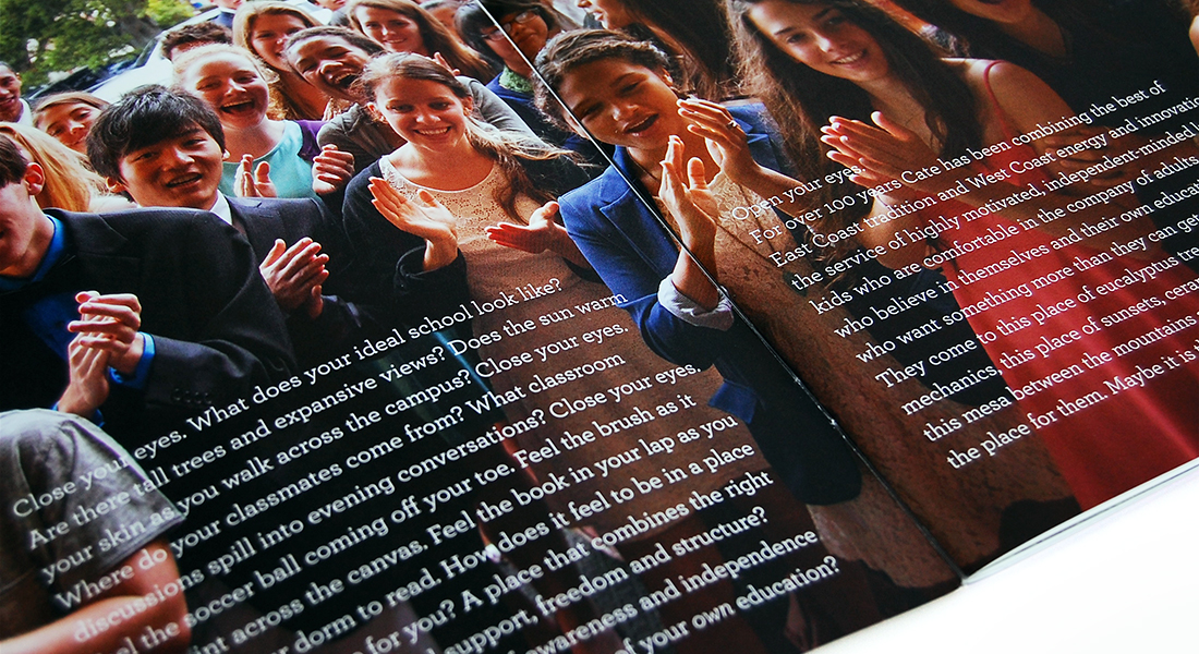
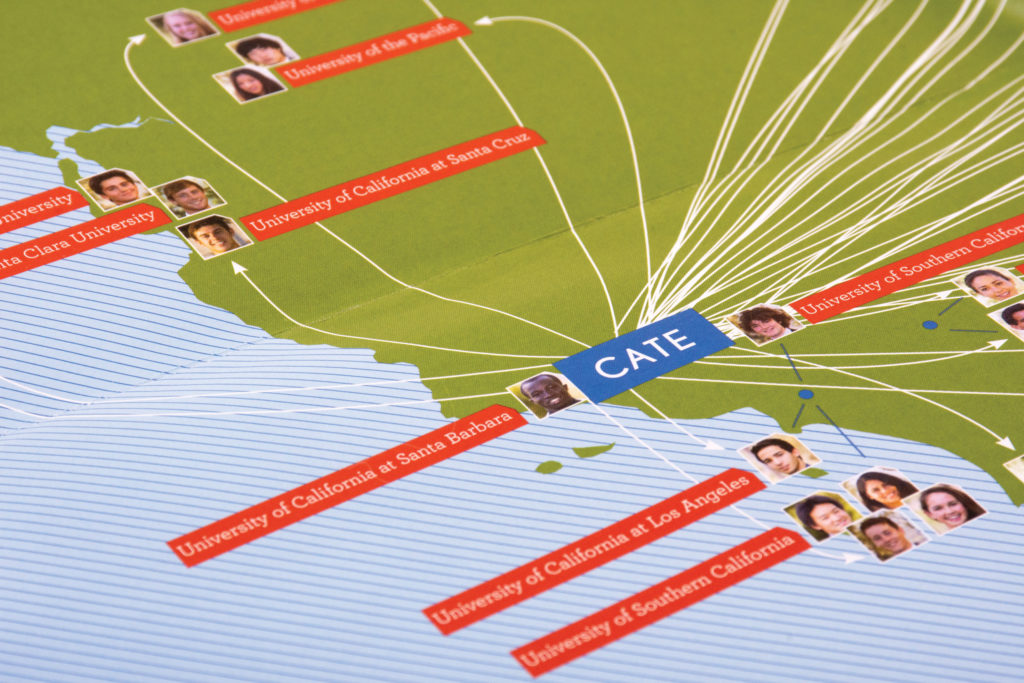
To evoke the essence of Cate and emphasize its academic rigor through copy, we partnered with Mark Sheehy Creative. Rather than getting bogged down in details, Mark’s writing pulled readers in, inspiring prospective families to learn more and ultimately arrange a visit to the school.
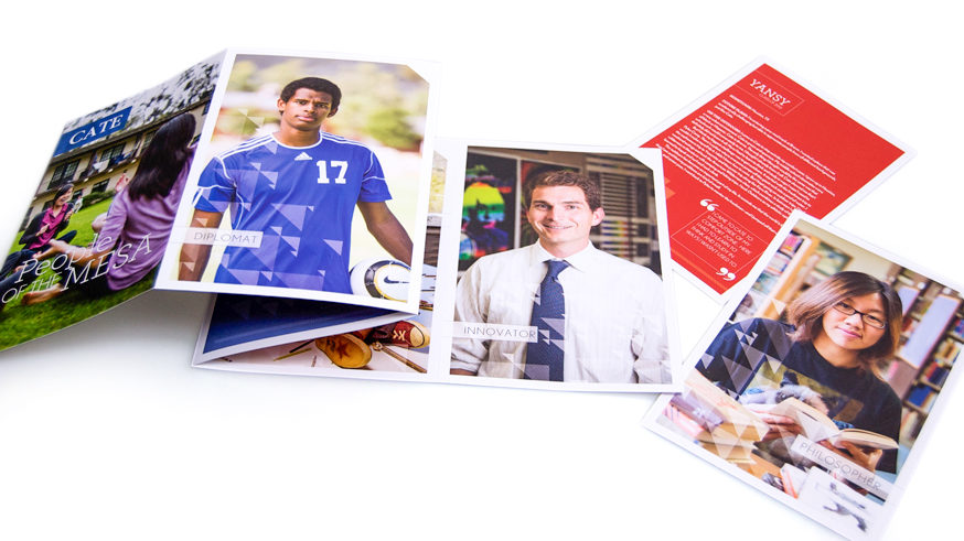
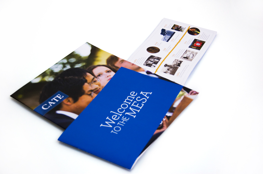
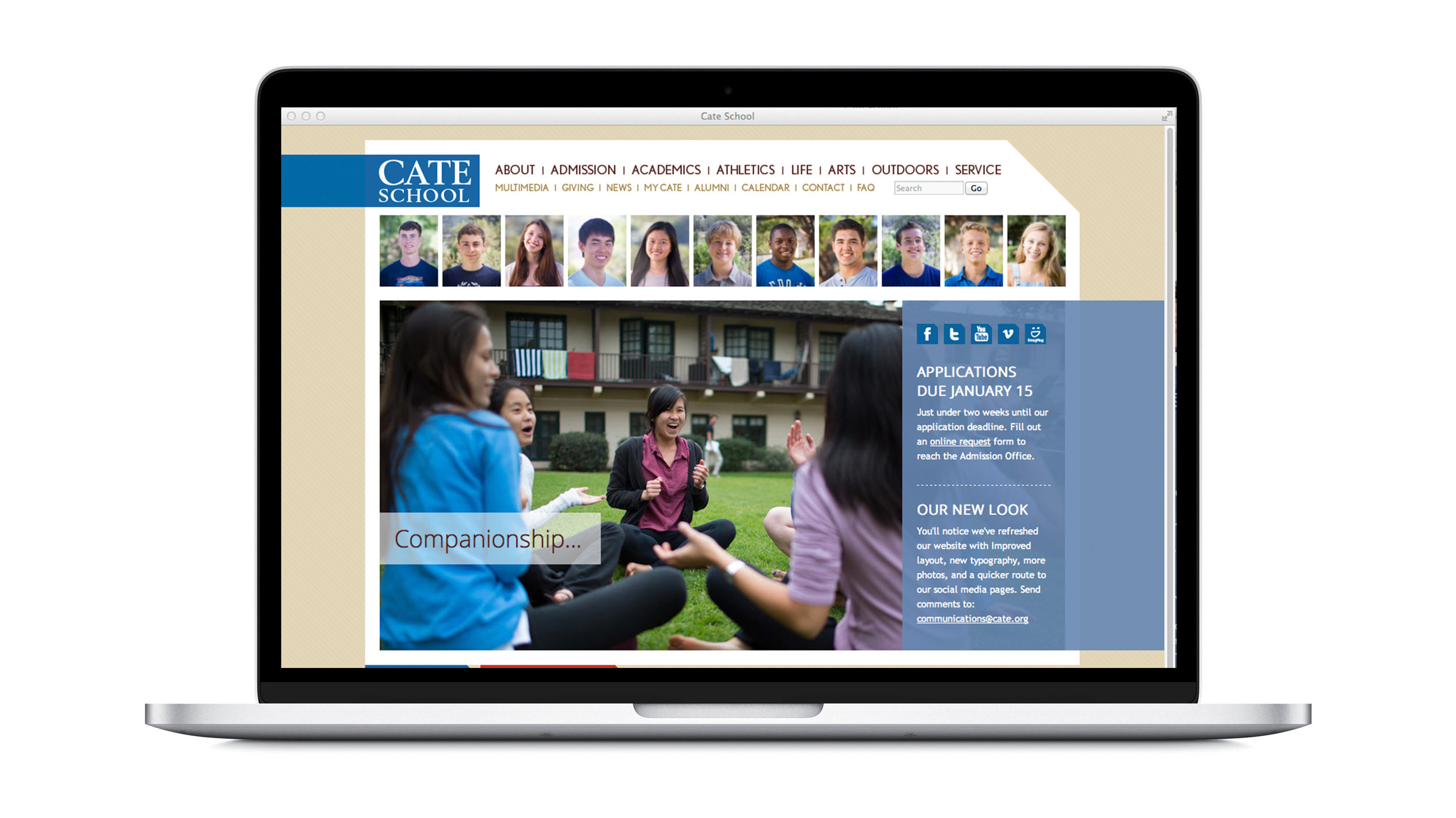
The end result was a series of printed pieces and a refreshed school website, each with their own interactive elements. The printed pieces mail in a clear acetate envelope, enticing recipients to open it—almost like peeking under the wrapping of a present. Complementing that experience, the website content goes even deeper, inviting visitors to explore and learn more about Cate School.