Work
Outstanding within a Brand System
USC Dornsife: The College of Letters, Arts and Sciences

An alumni magazine should capture a sense of place and bring someone back to a time and place in their lives. What does it feel like to be on campus — the energy, architecture, and lighting? These are elements that we absorb and transcend into the two-dimensional space of the magazine through our design and art direction to make the magazine unique to that institution.
The USCDornsife team (Senior Associate Dean for Communication and Marketing, Jim Key, Editor-in-Chief, Susan Bell, and Art Director Letty Avila), felt it was important to have a magazine unique to The College of Letters, Arts and Sciences while also aligning with the institution’s identity. We partnered with them to create a magazine representative of a liberal arts college within a large research university in Los Angeles.

The project kicked off with a comprehensive editorial critique of the existing magazine by our partner, Vicki Glembocki. An award-winning magazine to begin with, she recommended ways to vary the storytelling. A meeting with the Alumni Relations Council confirmed a desire for this shift. We learned that readers were looking for shorter articles, different points of view, alumni stories, and photography to represent the breadth and depth of Dornsife.
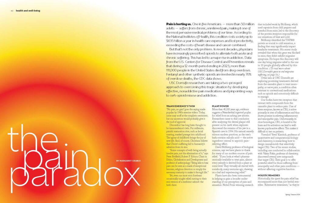
Along with hearing what their community wanted out of the magazine, the site visit revealed the uniqueness of LA, including the amazing light quality that illuminates the architecture. We leaned into their secondary color palette to capture this vibrancy while bringing in the primary university colors, cardinal and gold, sparingly.
We began by exploring two different design directions that were both visually rich with cinematic photography and captivating illustration. We crafted a more traditional approach that introduced a unique font for the theme to complement a more understated design. Our other concept used only National as the display copy and leaned heavily into color, giving this direction a hip and contemporary look.

The final design direction combined elements of each concept in a way that is unique to USC Dornsife — aligning with the institutional brand representing the scholarly community. The new visual direction includes more commissioned photography to capture the people and place to balance an abundance of originally commissioned illustrations.

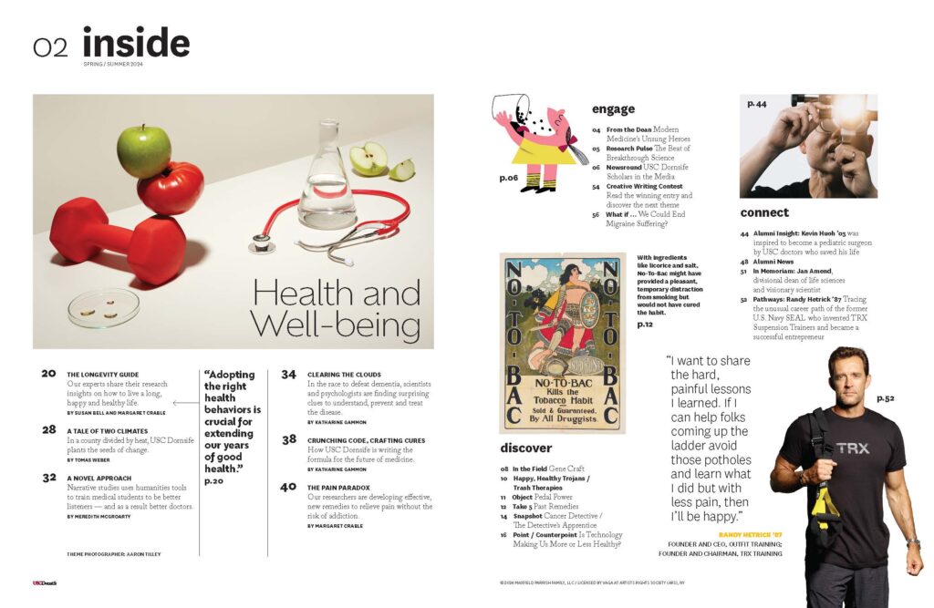
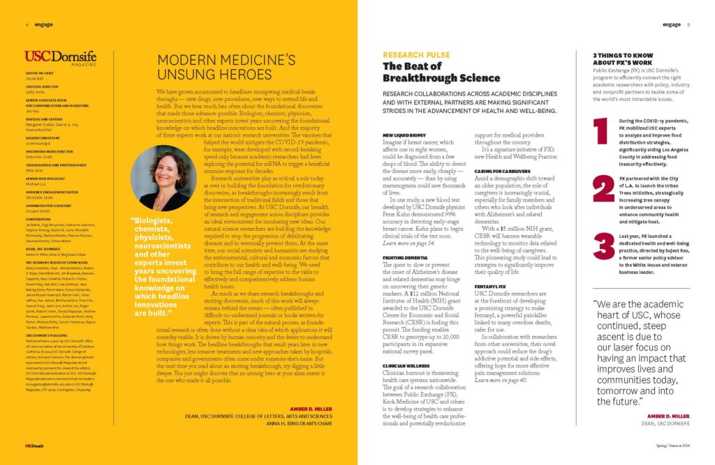

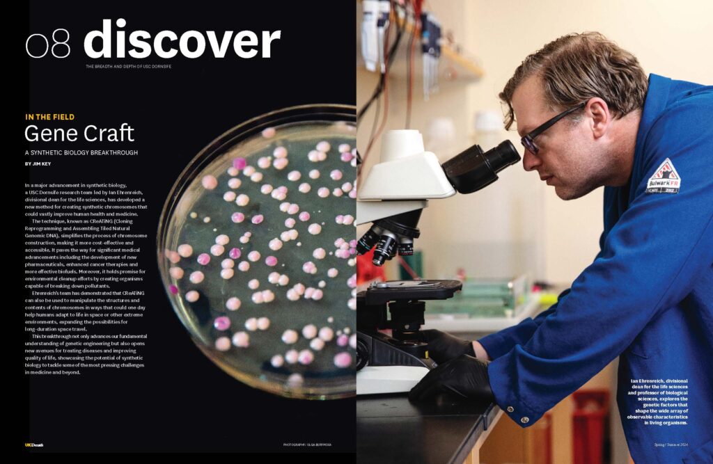


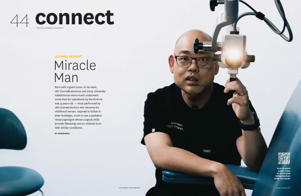

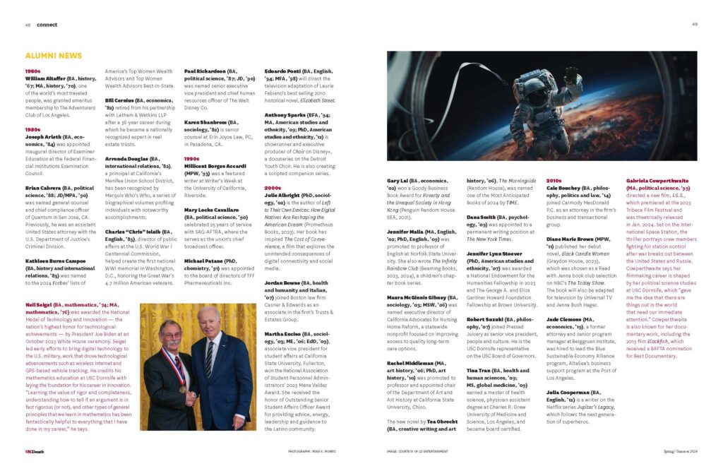

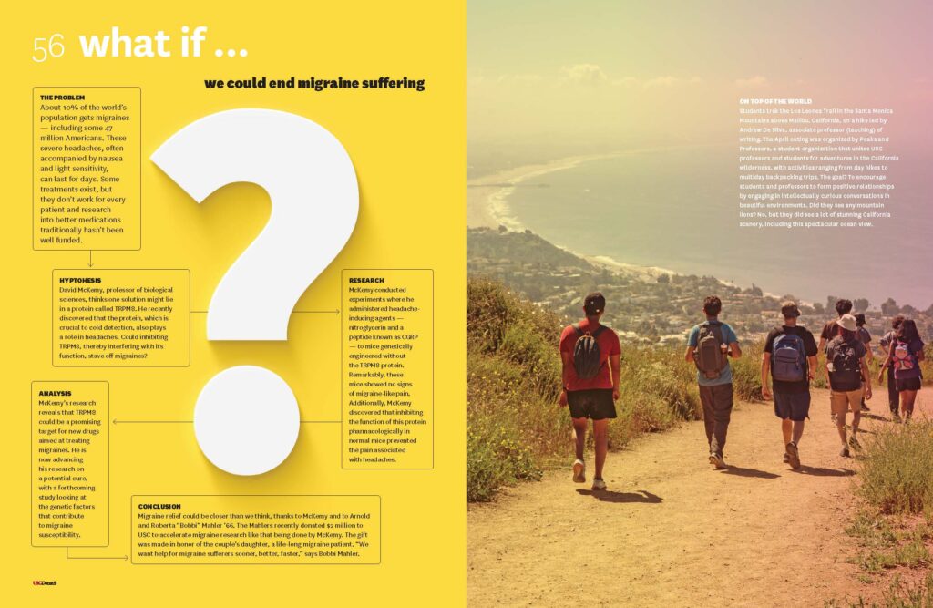
While we were initially skeptical about a themed issue — since they can end up feeling forced or promotional — it became clear that this was the best path editorially. As the oldest college at USC, often referred to as “The Heart of USC,” the theme allows for every department to share their perspectives. It also supports the framework for the feature well design.

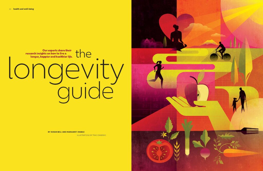


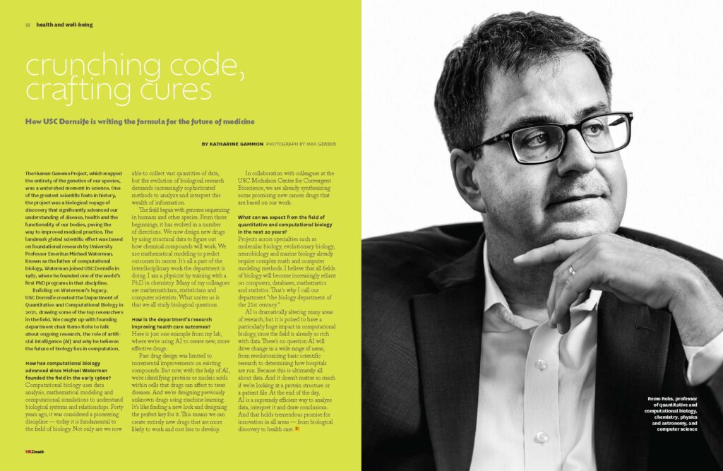
The final magazine met the objective set by the USC Dornsife team at the onset of the project: “Create a more modern, cutting-edge alumni magazine that stands out from its peers with a beautiful, impactful design that enables us to tell USC Dornsife’s diverse stories in a more compelling, imaginative, varied and creative way.”